 |
| [ Photo by Darryl Dyck ] |

Aren't our boys handsome? { the answer is YES! }
And how awesome are these new jerseys they're wearing?! I absolutely love, love, love it.
I adore how old-school and retro they look. A part of me wishes they will wear it more than once.
But don't get me wrong, I like their blue and green look too.
For those of you that are wondering why they're wearing this new jersey is because it marks the
100th anniversary of The Millionaires, founded in 1911.
[ You can read more about Vancouver Millionaires over here Vancouver Millionaires ]
So although my post is a day late (they played on March 16 against Detroit)
and the scores are out ... we lost 5-2.
I still think this maroon colour jersey deserves a post of its own!
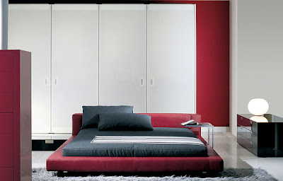
I wanted to find maroon used in interiors and here's how I've seen it being incorporated
 |
| [ via Mark English Architects ] |
 |
 |
| [ via Inhabit Design ] |
 |
| [ via Jane Kim Design ] |
Maroon can either be a bright, rich, deep or dark off purple color.
This is why it can sometimes be confusing to tell whether a colour is considered maroon or not.
In the photos from above, you can see that they've incorporated maroon into the space.
It can be overpowering if the whole space was saturated in that one colour...
If you want to create a balance, use a neutral colour palette.
Notice the rooms all use whites, greys and browns? This is how they achieve that harmonious look.
Now I just have to get my hands on one of those sold-out jerseys!
Hope you all had a lovely weekend
xx
Emily
[ Unfortunately some photos I couldn't find the sources for ]


0 comments:
Post a Comment